The beige epidemic
Walk through Singapore's newest hospitality venues. Grey sofas. Black chairs. White tables. Timber in one of three shades of "natural." Maybe a green plant as the only colour in the entire space.
Scandinavian minimalism. Designed for long Nordic winters where pale colours maximise scarce daylight. Got transplanted to tropical Singapore, where abundant light makes those palettes look washed-out. The result: a city of beautifully designed spaces that look almost identical.
Colour. The element most designers are avoiding. Is one of the most powerful tools for creating distinctive, commercially successful spaces. And there's data to back it up.
The business case for colour
Colour increases brand recognition by up to 80% (University of Loyola, Maryland). In Singapore's hyper-competitive market, with 30 dining options on a single stretch of Telok Ayer. A venue with a distinctive colour identity is measurably more memorable. The most successful hospitality brands get this: Soho House's green, citizenM's primaries, W Hotels' saturated lobbies. Colour is identity infrastructure, not decoration.
Colourful spaces get photographed and shared more. A bright red Gehry chair on a rooftop generates organic content every time someone sits in it. That's marketing you don't pay for.
And colour psychology is real. Warm colours increase appetite and energy in F&B settings. Cool tones promote calm and longer dwell times. A confidently coloured space signals design intention. Beige signals design committee.
Colour through furniture
Paint is flat. Artwork is singular. Soft furnishings fade. Furniture delivers colour in three dimensions, at human scale, where it has the most psychological impact.
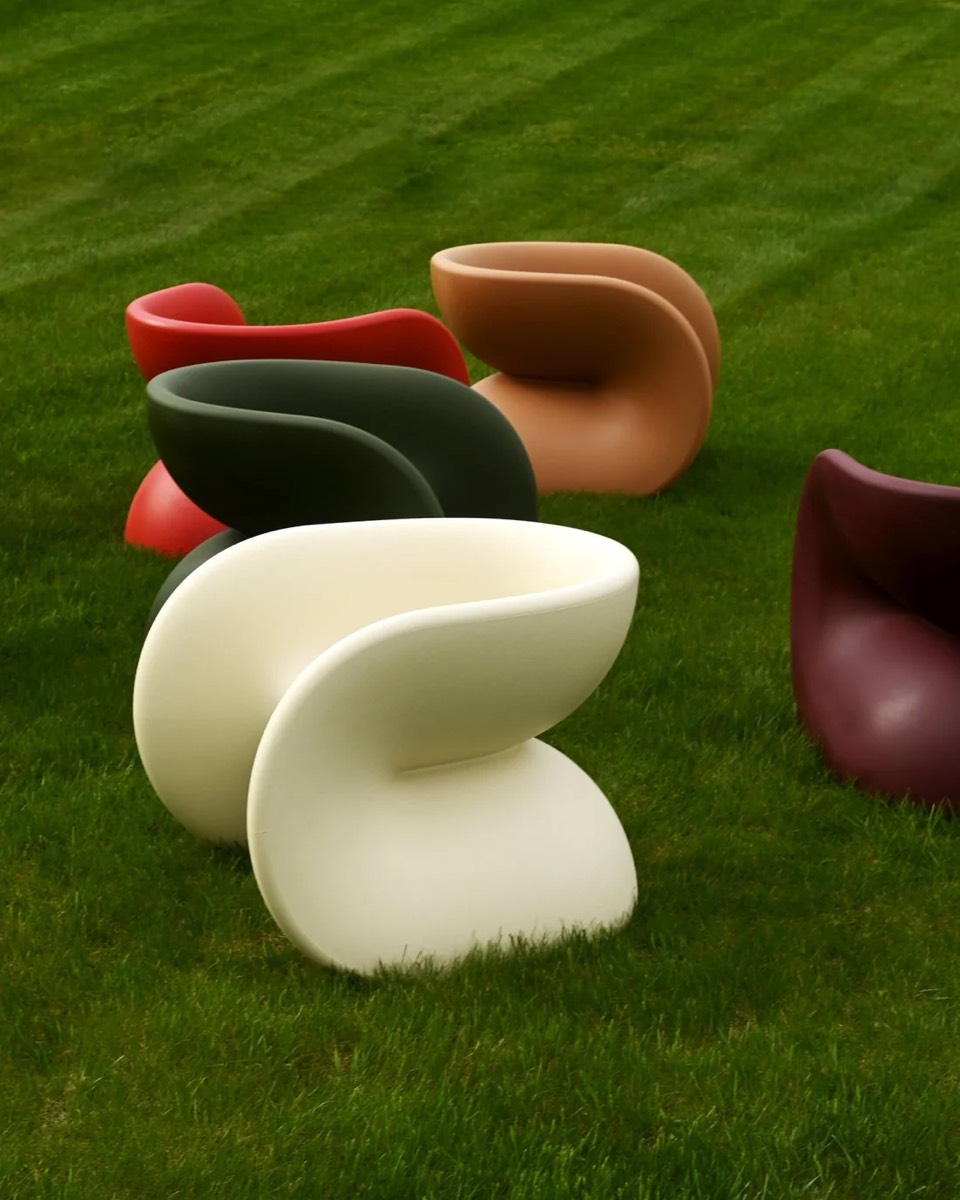
Heller: colour as architecture
Heller was built on colour. Since 1971. Primary reds, electric blues, vivid greens, sunshine yellows. Applied to pieces by Frank Gehry (MoMA permanent collection), Mario Bellini (eight Compasso d'Oro), and Massimo Vignelli.
The Gehry Color Chair is the benchmark. Four in bright red around a rooftop table. You've created the most photographed spot in the venue. The MT Rocker extends the story to lounge seating. A bold green rocking chair on a pool deck becomes focal point, photo opportunity, and brand signature in one piece.
Heller's colour is baked into the polypropylene resin, not coated on. It won't fade, chip, or wear. A red Gehry chair is exactly the same red in Year 5 as Day 1, even in Singapore's UV.

Mobliberica: permanent colour in ceramic
Mobliberica's 46 surface finishes go far beyond marble reproductions. Rich terracottas for Mediterranean spaces. Deep blacks for moody evening restaurants. Bold solids for designers ready to make the table itself a colour statement.
Combined with 32 frame colours and 280 fabric options, a restaurant can build a colour identity impossible to replicate from stock furniture. Guests spend 60–90 minutes looking at the table surface. It's the most consistent colour exposure in the room. And ceramic colour is permanent: fired at 1,200°C, it won't fade after a decade of commercial use.

Dressy: bold indoor colour
Dressy's palette challenges the living room industry's addiction to grey. Their teal sectional has become a signature hotel lobby specification. In a market where virtually every lobby sofa is grey, a confidently coloured sofa makes an immediate statement. Rich teals, warm cognacs, deep greens. Sophisticated rather than trendy, current now and still designed in 5 years.

Creavalo: colour as acoustic art
Creavalo's Lienzo acoustic panels accept any image. Any colour palette. Reproduced onto a sound-absorbing surface (αw 0.60, fire-rated B-s2,d0). Specify a wall in exact brand colours that simultaneously reduces reverberation. The Manhattan collection offers subtler colour interest: earth tones with natural variations from the recycled textile composition.
The only product we know of that lets designers specify wall colour, acoustic performance, and visual art simultaneously.

Colour strategy by space
Restaurants and bars
Use colour at specific impact points, not everywhere:
- Feature seating. Two or three brightly coloured chairs at the bar create a focal point. Colour is a seasoning. A little goes a long way.
- The table surface. A warm Mobliberica ceramic sets the tone for the entire dining experience.
- The feature wall. A Creavalo Lienzo mural. Acoustic treatment, art, and brand statement in one.
- Outdoor contrast. Heller's bright chairs against tropical greenery. Every guest photo is free marketing.

Hotels and resorts
- Lobby statement. A single Dressy sectional in a bold colour establishes design personality within seconds of arrival.
- Pool deck identity. Heller's coloured outdoor furniture in a single signature shade. The pool deck becomes photogenic from every angle.
- Room accents. Dressy coffee tables with coloured ceramic tops bring colour into rooms without repainting.
Co-working and office
- Breakout zones. Heller chairs in bright colours turn break areas into destinations.
- Acoustic branding. Creavalo panels in company colours. Identity reinforcement that also controls noise.
- Reception. A colourful Dressy sofa communicates personality better than any framed mission statement.
"But will it date?"
The most common objection. Here's why it's largely unfounded:
Colour vs. trend colour. Millennial pink will date. A confident red will not. Heller's primaries have been in production since 1971. Mobliberica's warm ceramics and Dressy's rich teals are rooted in material aesthetics, not trend cycles.
Neutrals date too. The all-grey interiors of 2015 already feel distinctly of their era. A dated neutral space fades into anonymity. A dated colourful space retains character and can be refreshed by swapping individual pieces.
Furniture is replaceable. Unlike tiles and joinery, you can change it. That's an argument *for* bold colour, not against it.
Standing out in Singapore
When someone scrolls Google Maps or Instagram looking for dinner tonight, they're scanning dozens of thumbnails. A flash of red chairs on a terrace. A dramatic ceramic surface. A teal sofa in a window. That's what stops the scroll. Neutral interiors, no matter how well-designed, look the same at thumbnail scale.
In the world's most competitive hospitality market, colour is a survival strategy, not a risk.
Ready to think in colour?
See the palette. Visit our showroom for Heller's bold outdoor colours, Mobliberica's 46 surface finishes, Dressy's fabric library, and Creavalo's acoustic art. Colour needs to be seen in Singapore's light.
Think beyond the chair. Tables (Mobliberica), walls (Creavalo), planters (Systemtronic). A holistic colour approach through furniture creates a more immersive result.
Read more: the Heller design story, Spanish design furniture in Singapore, and our full contract furniture range.
Contact us or WhatsApp +65 8952 9692 to start the conversation. In a beige world, bold wins.